This is not a thoughtful list. I’m just throwing it together because something made me think about John Singer Sargent, and that made me want to do a Top Five list, so I’m assembling this hastily because I’ve got a lot to do today.
It’s also not an honest list, because an honest list of favorites would consist entirely of people in my family, but my wife would give me trouble if I showed any of her watercolors, so consider this a Top Five List of Painters to Whom I Am Not Related by Blood or Marriage.
Maybe I’ll do a more thoughtful one later.
Here goes:
- John Singer Sargent. Y’all are probably tired of him because I know I’ve mentioned him before, such as when we visited the Isabella Stewart Gardner Museum in Boston. Now I’ve gotta to BACK to Boston because I just learned about his Triumph of Religion set of murals that he spent the last 29 years of his life trying to finish. I love his range, as well as his mastery in achieving he’s trying to do. He’s called an impressionist, but he’s good at whatever style you choose. Check out his use of light in this, or the hypnotic eyes in this. And dig the shadows in my very favorite, El Jaléo, which I encountered at Isabella’s museum.
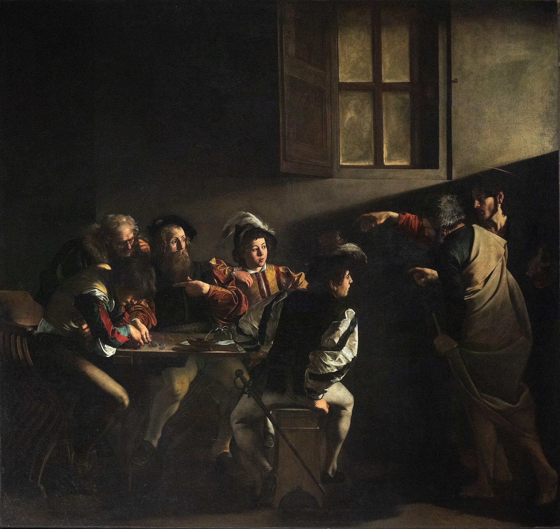
- Caravaggio. I learned about Caravaggio from a print that hangs in a hallway of my church, The Calling of St. Matthew. That’s it at the top of this post.
- Vermeer. Everybody talks about the Girl with the Pearl Earring, but my fave is Het melkmeisje, which I saw at the Rijsmuseum in Amsterdam. It’s not very big, but it is very impressive. I saw a lot of Rembrandt there, too — some greats including The Night Watch and those dudes from the Dutch Masters cigar box, but that would be so cliche to choose him, right?
- Anders Zorn. OK this is almost the same as picking Sargent, because I mistake his work for Sargent’s sometimes, but I like his work on its own. Especially his portait of the aforementioned Isabella (which is better than Sargent’s portrait of her), and The Omnibus. Although, as I’ve said before, I like George William Joy’s version of the omnibus them better (more communitarian, or something — more people, anyway). Y’all know how I love public transportation. And though I definitely don’t love tobacco, I like this one as well.
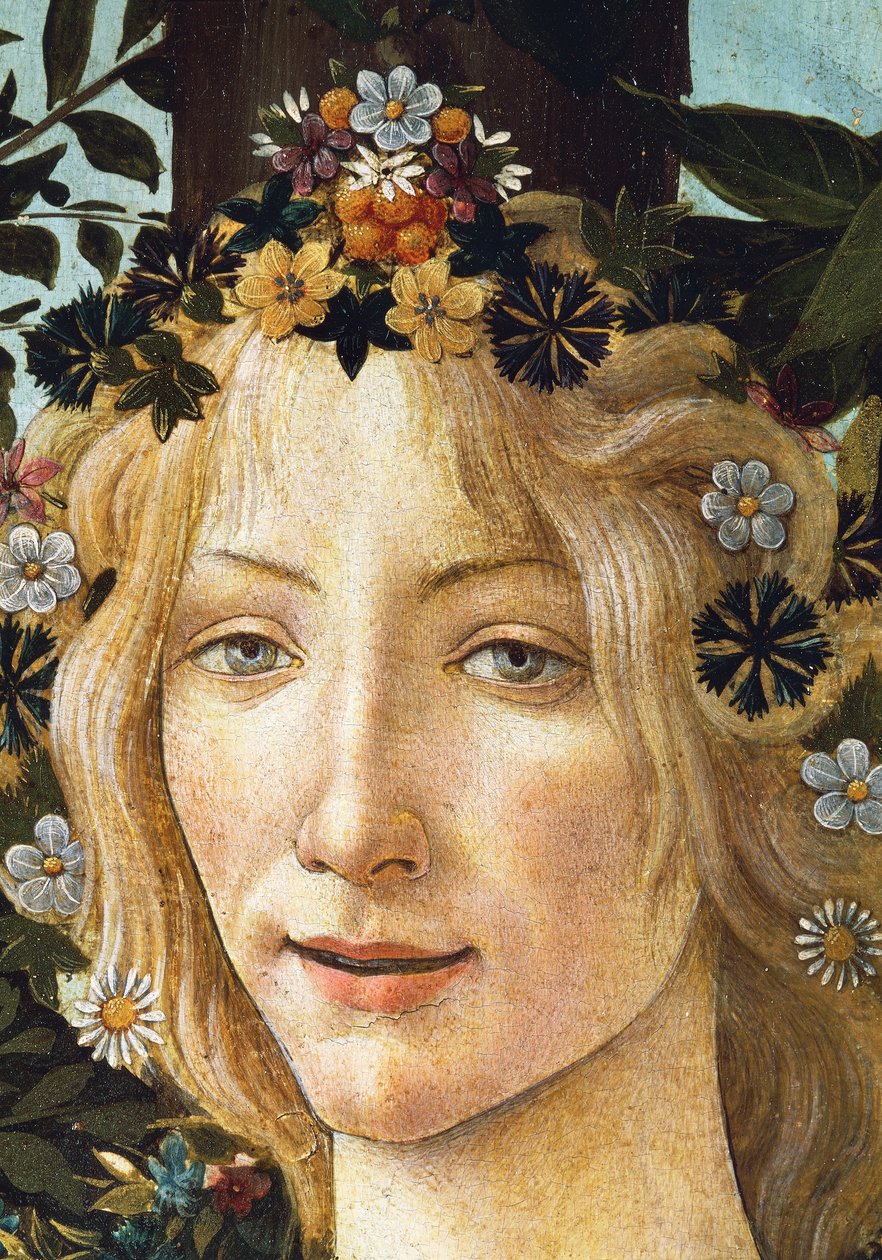
- Boticelli. Nope, not the Venus one. My fave is Primavera, especially this detail.
That’s it. Thoughts? I know a lot of this is repetitive, but I don’t remember doing a Top Five on painters, and am curious to see what y’all will tell me I left out.
Don’t mention Michelangelo, though. I’ve got a bone to pick with him, which I’ll explain in a subsequent post…


_van_het_Amsterdamse_lakenbereidersgilde_-_Google_Art_Project.jpg)
#/media/File:Anders_Zorn_Omnibus.jpg)